The IBNS Symbols
by Peter Symes, IBNS #4245
Version française ici
For the first several years of the IBNS there was no concept of an IBNS symbol; that is, a graphic depiction which could represent the IBNS. In the December 1963 issue of the IBNS Journal (now referred to as Volume 3 Number 3) the front cover carried the image shown in Figure 1. This graphic design was used in two variations on the front of IBNS Journal until the Spring 1966 edition (Volume 5 Number 4).
Interestingly, there was no announcement of the introduction of this device and no explanation of what it represented. Some of the graphic design is self evident, but some of the design remains a mystery. The circular text of ‘International Bank Note Society – Founded A.D. 1961’ declares the Society’s name and the date the Society was founded. The pentagon within the circular text holds the names of each inhabited continent on each bar: Australia, America, Africa, Europe and Asia. (America, interestingly, is not broken into North and South America.) The object within the pentagon remains a mystery. Apparently the end of a roller with a rope entwined around a plate with hooks; it is not known what this is meant to represent, but it is assumed there is a paper money connection.
This graphic representation (above) was used for three issues – Christmas 1963 (Volume 3 Number 3), Spring 1964 (Volume 3 Number 4) and Summer 1964 (Volume 4 Number 1) – before an adjustment was made. From September 1964 (Volume 4 Number 2) the text ‘Founded A.D. 1961’ was removed (see Figure 2). The last edition to carry the modified design was Spring 1966 (Volume 5 Number 4).

Figure 1

Figure 2
No symbol representing the IBNS was again evident until 1971 – ten years after the IBNS was founded. In IBNS Journal Volume 11 Number 2 – December 1971, on page 69 (the Contents page), the graphic image depicted in Figure 3 was introduced. The following description of the image (or logotype) and an explanation of how the symbol was adopted appeared on page 74 of the same edition of the Journal.
Description of the new logotype of the International Bank Note Society adopted at the annual meeting in Washington, D.C., U.S.A., August 1971:
Recognizing the need for a symbol to be used by the International Bank Note Society, the new design was submitted and formally approved at the annual meeting. Most learned societies have such logotypes which are used on journals, certificates, official stationery, meeting signs and other places where recognition is desirable.
Some time ago I suggested the usefulness of such a device and was assigned the responsibility of preparing a proposed design. Certain elements of the design should be explained. They are as follows:

Figure 3
- The central feature is an old woodcut illustration of a wooden screw press used for about 400 years until about the mid-nineteenth century. Since paper money is printed on a press, a historical type seems an appropriate motif. The portion of the press extending up and to the right is the tympan and frisket used to hold the paper and prevent smudges. After the type or the carved block was inked, the tympan was folded over onto the inked surface, the entire type form (Iower portion) and tympan (upper portion holding the paper) was pushed under the platen (the block directly beneath the screw). The printer then rotated the handle on the screw which exerted pressure on the paper.
- Since the I.B.N.S. is truly an international society, a portion of the globe is used to represent this. (The projection is a Mollweide Equivalent Projection.) It is quite distorted as maps go, but presents an impression of a curved surface.
- The type selected for the International Bank Note Society which "circles the globe" symbolically is Times Roman. A type face with serifs, while not modern, does add a dignity that a sans-serif style lacks.
- The Society is embarking on its second decade. The founding date of 1961 reminds us that a great deal has happened in the intervening ten years. I.B.N.S. now ranks with other well established numismatic organizations around the world.
Designed and submitted by William E. Benson (C-158)
This symbol, designed by William Benson, was used uninterrupted for many years on IBNS publications. After Owen Linzmayer took over production of the IBNS Journal, he felt a colour symbol was appropriate and arranged to have the black and white image transformed into a colour image (Figure 4). This symbol first appeared on IBNS Journal Volume 46 Number 3 in 2007 and remains in use. The older image is still used on IBNS publications which are not printed in colour, such as the IBNS Directory and the auction catalogues.

Figure 4

Figure 5
Leading to the fiftieth anniversary of the IBNS, in 2010, a competition was held to select a symbol to use during the anniversary year. At the same time, a competition was held to select a symbol to be used by IBNS members. David White prepared both winning designs, which were subsequently finished professionally by a graphic designer. The fiftieth-anniversary symbol (Figure 5) depicts the IBNS symbol (Figure 4) surrounded by a laurel wreath, below which is a banner bearing the words ‘Golden Jubilee – 1961 – 2011’.
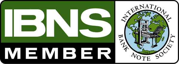
The member symbol (Figure 6) includes the text ‘IBNS Member’ and the IBNS symbol (as shown in Figure 4).
IBNS members are not permitted to use the IBNS symbols (as depicted in Figures 3, 4 and 5) and the IBNS Bylaws (Article VIII, Section 5, in part) state:
‘Individual IBNS members offering paper money for sale or trade may, solely for the purpose of identifying themselves as IBNS members or of advertising and promoting the society, use the letters “IBNS” and such society logos, seals and trademarks as the executive board may specifically authorize for this purpose.’
The symbol at Figure 6 was produced as the ‘society logo’ for this purpose, so individuals can identify themselves as members of the IBNS. This symbol can be downloaded from the IBNS web site (www.theIBNS.org) by members, after they sign in, and members are encouraged to use the symbol on their web sites and stationery.
There have been suggestions, over the years, the IBNS should replace the symbol introduced in 1971 with something a little more directly representative of a banknote. To date, no effort has been made in this direction and the symbol introduced by Bill Benson remains in use, albeit now in a colour format. Having served the society for 40 years, it will at least carry us forward into the next period of the Society’s future.


